
Here at OARDC we have an active weather station at our Wooster campus, and at 17 other sites across the Buckeye State. Current and past data for these stations is available free of charge online. So you can certainly check our weather at anytime, but that still leaves the question: will we have a white Christmas this year? Here's a fun way for older elementary to high school students to use historical weather data to create a map and color key to illustrate the likelihood of a white Christmas while learning about contour maps. The following lesson plan is based on the lesson available at educationworld.com
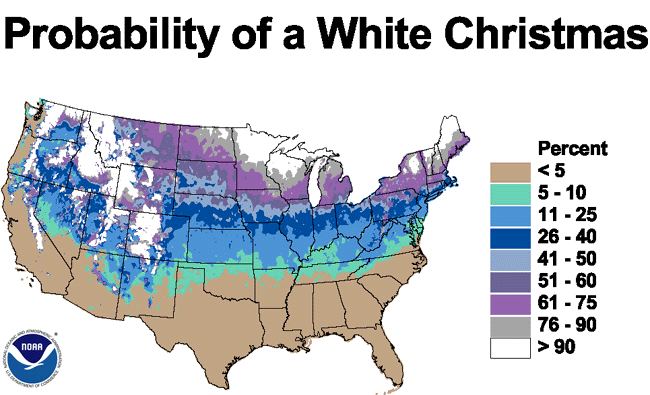 |
| The National Climatic Data Center has calculated the probability of a White Christmas for the entire US (below). This map is based on the full range of data for each site rather than the 1971-2000 normal. |
Here's what you'll need:
- A color temperature map (many newspapers like USA Today publish such a map daily and are even available online)
- Recording of the song I'm Dreaming of a White Christmas (optional)
- White Christmas Weather Data worksheet available free online
- US outline map available free online
- Atlas
- Crayons or colored pencils
Will your students enjoy a white Christmas this year? Let's see what the historical weather data has to say about the likelihood for your part of the country...
- Start by showing students a color temperature map. Discuss how the map can be a quick guide to determine the current or high temperature for the day. Point out the color key as a tool to guide interpretation of the map.
- Ask students if they have any idea how this map, called a temperature contour map, is created. The color contour map is imply a pictorial representation of weather data. In the case of a contour map that shows the current temperatures around the United States, the data is a long list of temperatures in cities around the country. Students could create their own color contour map by gathering this data, plotting the temperatures in a wide variety of locations on an outline map and "connecting the dots" to approximate the approximate areas in which the temperatures are in the 20s, 30s, 40s, 50s, etc.
- For practice, you may want to provide students with data from a local paper on temperatures recorded the previous day or the high temperature estimate for the current day. Use the list to plot locations and temperatures. Demonstrate how students can create a color contour map to show those high temperatures. Then have students map the low temperatures of the day from the same source.
- Introduce and play the song I'm Dreaming of a White Christmas and pass out the White Christmas Weather Data worksheet. This worksheet includes figures representing the percent likelihood of snow being on the ground Christmas Day in 40 cities around the United States. This worksheet is intended for grades 5 and up. Younger students can focus on a state or region and map data for that smaller area. For example, the Illinois State Climatologist Office provides data for 13 sites across Illinois on the likelihood of snow on Christmas day. You may be able to find similar data for your state or region as well. Stormfax also provides a nice set of data for various states and regions.
- Have students plot the data on their map then create a color key to guide them as they color their contour maps. The color key will denote a different color for locations where the percent likelihood of snow on Christmas day is 0-20 percent, 21-40 percent, 41-60 percent, 61-80 percent and 81-100 percent. Be sure students understand that the maps they create are a simple approximation of the likelihood any area will have an inch of snow or more on the ground Christmas day. Geographic location can account for vast differences in snowfall in a small area. For example, their map will show that much of Arizona has little chance of snow cover on Christmas day, but a small area of the state, around the city of Flagstaff ( located in the mountains in the middle of the state) has a 57 percent chance of snow coverage on Christmas day!
- Have students share their maps with one another and with the class and discuss how accurately those maps depict the likelihood of snow cover. Check maps for accuracy in plotting city locations, but grant leeway in judging the final contour maps. Some variation needs to be allowed for where the controus might break between the plotted cities. Students should also have the opportunity to express in writing thelessons they learn (math and geography) from the activity.


No comments:
Post a Comment